
The Psychology of Color: A Strategic Guide for Designers
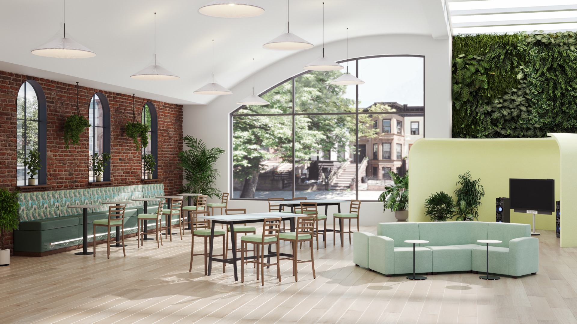
Color is never just an aesthetic choice—it is a functional design tool. When specifying furniture and spatial layouts across commercial environments, color directly influences cognitive performance, emotional well-being, and occupant behavior.
Higher Education
Educational environments require a balance between high-energy collaboration and deep individual focus. • Yellows & Oranges are ideal for student commons, innovation hubs, and group study zones—warmer, vibrant tones stimulate creative thinking, social interaction, and mental agility. • Blues & Greens are best suited for lecture halls, libraries, and quiet study areas; soft blues reduce anxiety and support prolonged concentration, while biophilic greens lower eye strain during long study sessions.
Senior Living
Color in senior living must prioritize physical comfort, spatial legibility, and emotional reassurance. • Soft Pinks & Terracottas bring a sense of optimism, comfort, and security to private living quarters and dining areas without overstimulating residents. • Sage Greens & Lavenders are highly effective in memory care and wellness suites, decreasing restlessness, relieving anxiety, and fostering a peaceful atmosphere.
Corporate & Community Spaces
Modern workplaces rely on varied palettes to support activity-based working, anchoring distinct environments for focus, collaboration, or rest. • Deep Blues & Grays are excellent for executive boardrooms and individual workstations, communicating stability, trust, and sustained task focus. • Vibrant Reds & Pink Accents, introduced through task seating or lounge upholstery in breakout zones, inject energy, stir conversation, and refresh employees during short breaks.
Cafeterias & Food Service
High-traffic dining settings require color palettes that encourage comfort, movement, and appetite. • Warm Earth Tones & Rusts—subtle terracotta, muted orange, and rich wood elements—elevate warmth and comfort while naturally stimulating appetite. • Clean Neutrals with Green Accents signal health and cleanliness, creating an inviting backdrop that avoids the frantic feel of bright primary colors.
Government Facilities
Public-facing civic environments demand palettes that project permanence, clarity, and calm accessibility. • Navy, Slate, & Forest Green are classic, low-saturation tones that convey authority, reliability, and security in formal meeting rooms and administrative suites. • Soft Blues & Warm Whites, applied in public lobbies and service centers, reduce visitor stress, maintain order, and foster clear, productive communication.
By leveraging the emotional and physiological impact of color, interior designers can transform commercial furniture selections from simple decorative statements into long-term strategic assets.